Jun 08, 2026
Building Walden's pitch board flow
In-depth design system case study
When we started shaping the pitch board for Walden, the goal was to create a flow that could hold up as the product grew. Pitches move through real states (draft, in review, ready to bet). People need to scan a board, filter fast, switch between card and list view, and know what to do when nothing matches. That meant designing the experience and the system underneath it at the same time. (If you're not sure what a pitch is, check out my ShapeUp post)
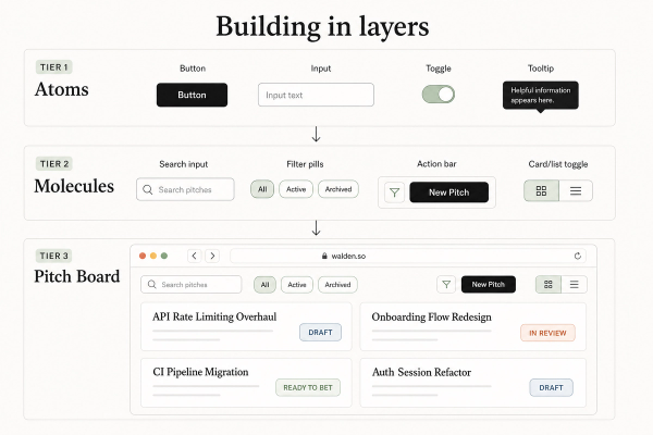
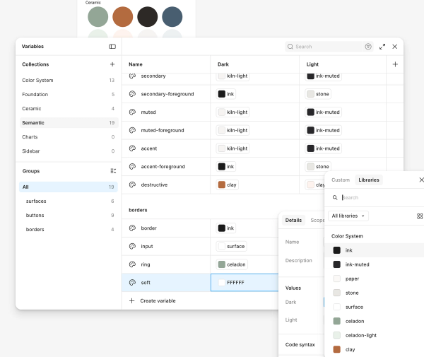
In Figma I have been working on our design system and at this point, we have a vast component library to pull from. Atoms came first: buttons, inputs, toggles, tooltips, each with variants for style, size, and state. Light and dark mode were baked in from the start with Figma variants. Filter pills got their own treatment (off, on, hover) because they show up everywhere on the board. Molecules followed naturally: a search field with an icon, a filter row, an action bar with a primary CTA and a segmented view toggle. The pitch board UI is basically those pieces composed into layouts.
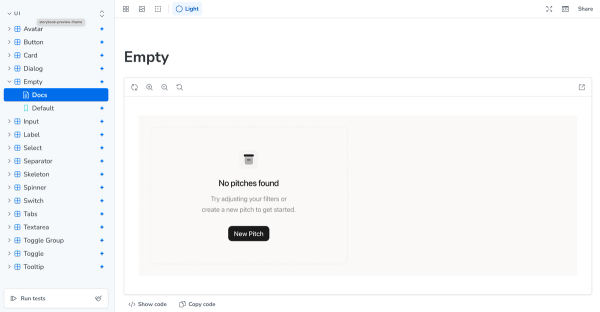
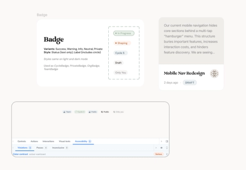
I am a big fan of documentation, so our Figma file has all of the things that design or eng would need. I also use Storybook as a bridge between design and code because it has a lot of extra great features. Every primitive lives next to its story, with controls for variants and a theme toggle to flip light and dark. The accessibility addon catches issues early: focus rings, contrast, keyboard behavior. That matters on a board full of interactive chips, icon buttons, and menus. Building in Storybook also forced consistency. If a toggle looked wrong in dark mode in the story, it was wrong everywhere. As the UX eng for the team, I spend most of my time working between these too places and popping in to our code to make changes, as needed.
The pitch board in the app reflects that system. Status filters use pressable toggles, not custom buttons reinvented per page - this saves eng a lot of time and keeps our product looking consistent. The action bar composes the same small button and toggle group patterns. Empty and loading states use shared components so the board never feels like a dead end. Even where we stretched the design (compact search, status-colored selects), those are documented as patterns so we can keep a consistent experience throughout the app.
Working this way now means the pitch board is not a one-time design handoff, but a foundation and a system. New surfaces can pull from the same atoms and molecules, and Figma, Storybook, and the codebase stay aligned. If you work somewhere between design and engineering, I highly recommend spending the time to get these systems in place early and build off of them.
Walden is not public yet, but you'll be able to see it in Summer 2026!
Gallery