Jun 05, 2026
Building a design system
while the product is still finding its shape
Lately I've been working on Walden with Virtu Studios. It's a web app for teams who shape, bet on, and build work in focused cycles. It's the kind of product where the UI has to stay not be in the way, but still feel considered. We're promoting focus and intention with each step of the cycle.
When I started working on the design system, I had already decided on colors for the brand, typography, etc., and the devs were hard at work making prototypes for certain features. The systems were being created alongside our dev team and we had to create a shared language early on to make sure we could move quickly and keep consistency while building the app.
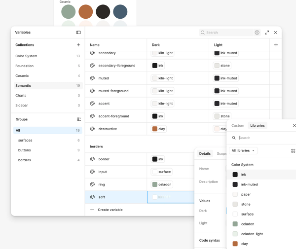
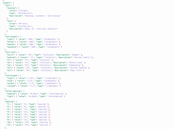
I started with tokens. Colors, type, radius, spacing. The Ceramic palette (celadon, clay, kiln, ash) sits on a paper-and-ink foundation, with light and dark modes baked in from the start. I pulled the production values straight from our CSS and turned them into Figma variables, with semantic names like background, foreground, and ring aliased back to the brand primitives. That part may sound weird, to go from code to Figma... Since I also work as a frontend dev with this team, sometimes it's just as helpful to code first, design later on MVP and prototype style work. Since we already had some components built and the color system thought out, I just had to create documentation on how colors get used: celadon for focus and progress, clay for destructive actions, the -light variants for badge fills. Tokens aren't just hex codes, they're decisions and I tried to be minimal and intentional. Once those decisions were made, we made a few tweaks in the code and the system came to life!
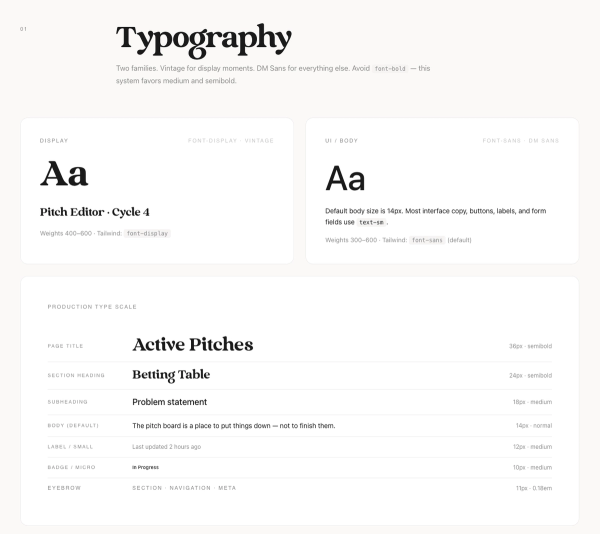
Typography came next, and it's probably my favorite piece. Vintage for display moments, DM Sans for everything else. We documented the scale in a branding guide (page titles at 36, body at 14, eyebrows at 11 with wide letter-spacing) so Figma and the app could match without guesswork. I love the editorial look (hence the look of my personal site here), and mixing some serif and sans-serif felt like it really matched this product.
On the code side, we're on Tailwind v4 and shadcn/ui, which gave us solid primitives fast. Then we layered in product-specific pieces: cycle badges, status pills, a custom icon set, and the bigger feature surfaces like the pitch editor and betting table. The goal was never pixel-perfect mockups for every screen. It was repeatable patterns we could trust.
One thing I didn't expect: building the system while the app was in active development actually helped. Early testing and feedback surfaced real states we needed (empty, loading, error, in progress) and the tokens made those updates quicker to ship consistently. If you're a designer or engineer thinking about UX engineering work, that's the part I'd highlight. The craft isn't only in Figma or only in React. It's in the connective tissue between them. Walden is still in QA, still evolving, but the system finally feels like something we can build on and move much quicker!
I'm so excited to share with the interwebs everything we've been working on! Had to at least share this little teaser and #buildinpublic as much as I can without spoiling all of the fun stuff we plan to unveil. Keep an eye out for a launch this summer!
Gallery